Veygo Design System

The challenge
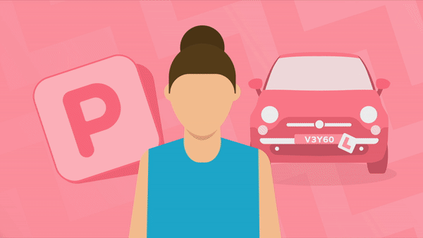
Before I started at Veygo the marketing team had created a blog with around 100 articles, the goal of this being to rank higher with SEO and become an information hub on the site and on social media. One issue however was that before joining the team all of these articles were paired with basic stock photography which left readers uninterested and didn't represent the Veygo brand. The reason for this was due to time constraints and the number of articles being put out weekly. With multiple new articles being created weekly it meant that there was a big strain on design to create consistent graphics that work across both social media and the website as well as giving clear information on what the article is about.
Creating the Veygo Design System
The solution to this was to create the "Veygo Design System" which all current and future blog posts are built from. By creating a large number of illustrations that follow the same color scheme and use the same perspective it is possible to build a number of blog banners for any situation and reduce the need for bespoke graphics later down the line.
Some key features I wanted to come through the system include the V background which has become a staple of our brand. I also wanted to keep the banners clear for the blog so users can easily interpret what the article is about. Whereas with social the goal was to grab customers’ attention with clear titles and adapting the illustrations already created.
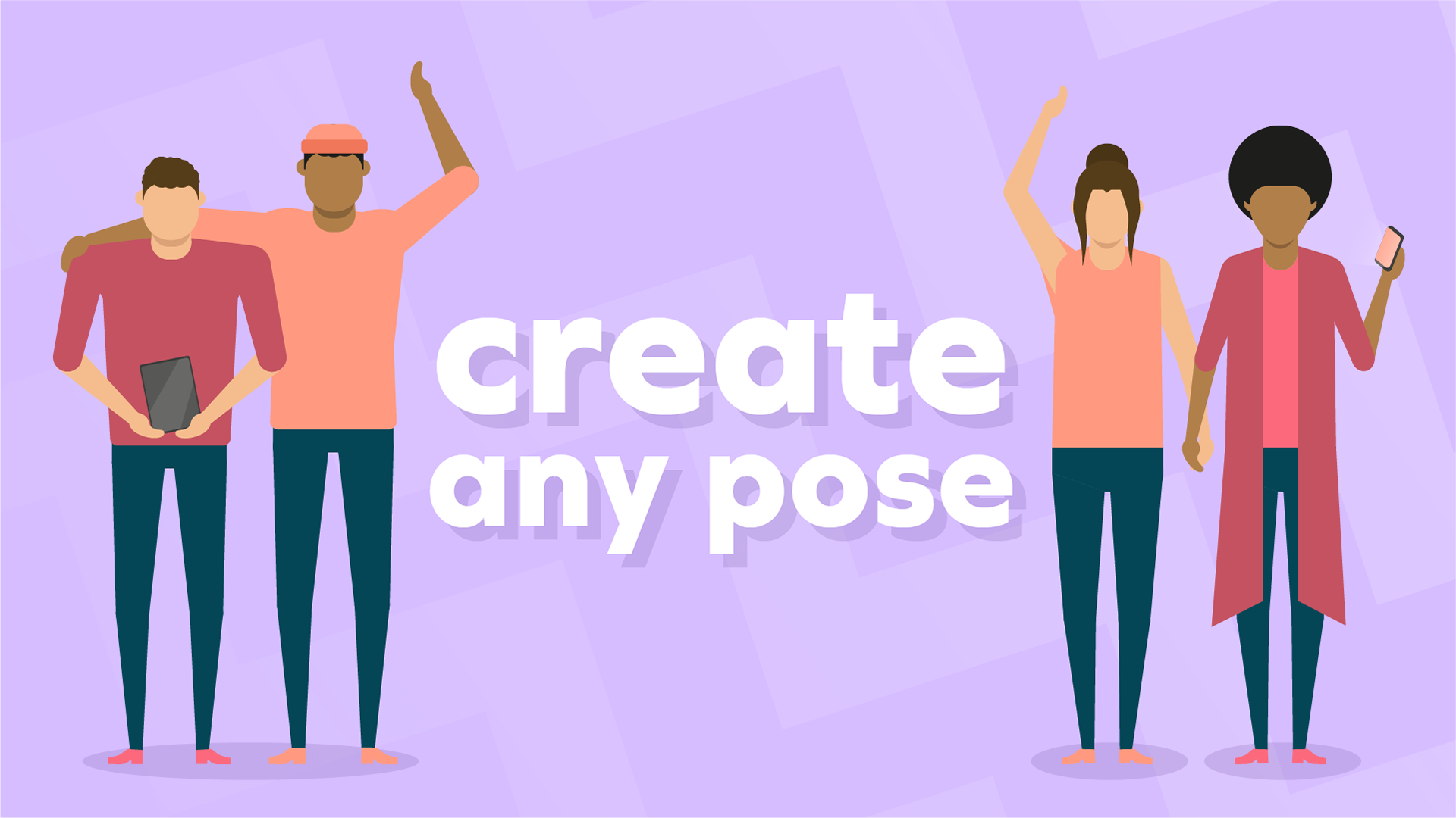
Creating the ‘VeyPALS’

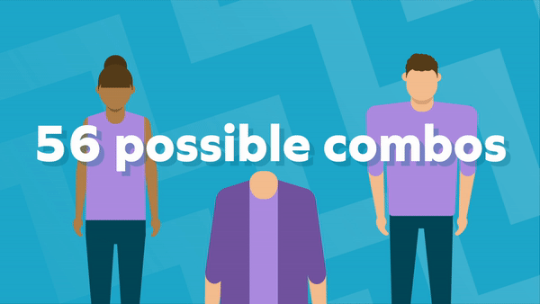
I also wanted to convey the message that people are always at the heart of everything Veygo do. To do so, in all the graphics the Veypals (Name used to describe human characters) are the only things in full colour, this allows them to have clear contrast against their monochromatic surroundings. While creating these Veypals I included "joints" which meant that they could be easily posed in a number of different positions.