
Loqbox Design System

When I joined Loqbox, they had a deadline of 3 months to rebrand the entire site ready for their Winter campaign launch.
For the past year, there was no dedicated designer, and product managers designed features for their respective teams without adhering to Design / Figma standards, resulting in broken components and poorly named elements (Think “Layer 258936” - Group “26846”). There was an existing design system that was detailed, but outdated which ended up making it difficult to modify or update components when needed.
My goal was to create a new design system and rebrand the site to align with the forthcoming rebrand and app release (a financial-focused app similar to Mind and Calm for building finances.)
The challenge
Blockers
When undertaking this project there were some external factors to consider with this project. These included:

This was my first project with the team so the components and engineering process were new to me and I needed to hit the ground running to be able to achieve the short deadline.
New to the team

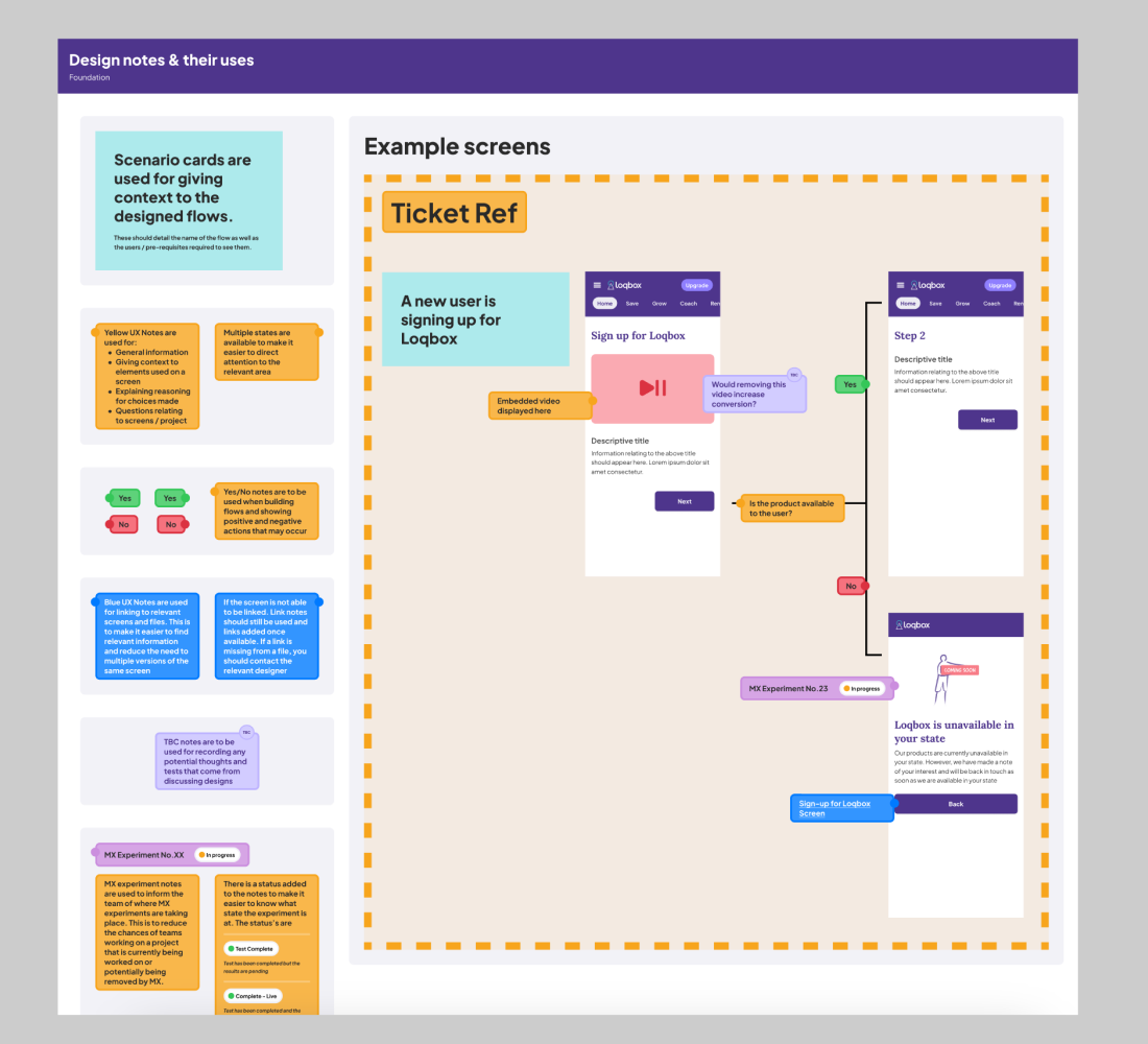
Due to the team not having a designer for some time, the Figma’s no longer matched what was live so flows and behaviour had to be mapped out separately before rebranding.
Unclear doc’S

At launch, the project was scoped as being the entire website that needed to be rebranded with all new components, colours, and styling.
Huge task

Not enough time to do full testing of the components - Meaning that we could only reposition and tweak the pages as I wanted to reduce the impact on drop off as much as possible.
Short deadline
Getting it done
With limited timescale, I focused the design efforts on the highest traffic areas for the site. This included Sign-up, Product feature pages, and the home page.

STEP 1: To help get a feel of the current website setup I conducted a heuristic review. Using a red, orange, and green post-it system I was able to access features that worked well and areas of improvement for the team to investigate in the future. This ended up giving me a good overview for how the different products functioned and the experiences our users faced when using the site.

STEP 2: Reviewed the existing DS and implementation and changed the designs at the base level. This means that any changes made on a component level are applied throughout the site, not just to the pages we were looking at. Allowing the site to still be on brand and giving the team time to iterate after the initial release. This also resulted in reduced development time as developers were often able to alter existing code, rather than begin from scratch.

STEP 3: To address any missing Figma flows I worked with the QA team to get recordings of what our users see and built new files based on them so we had an indicator of our user flows. This helped clear up many of the existing features Loqbox offered their users as some information had been lost over time/when team members had left the company.

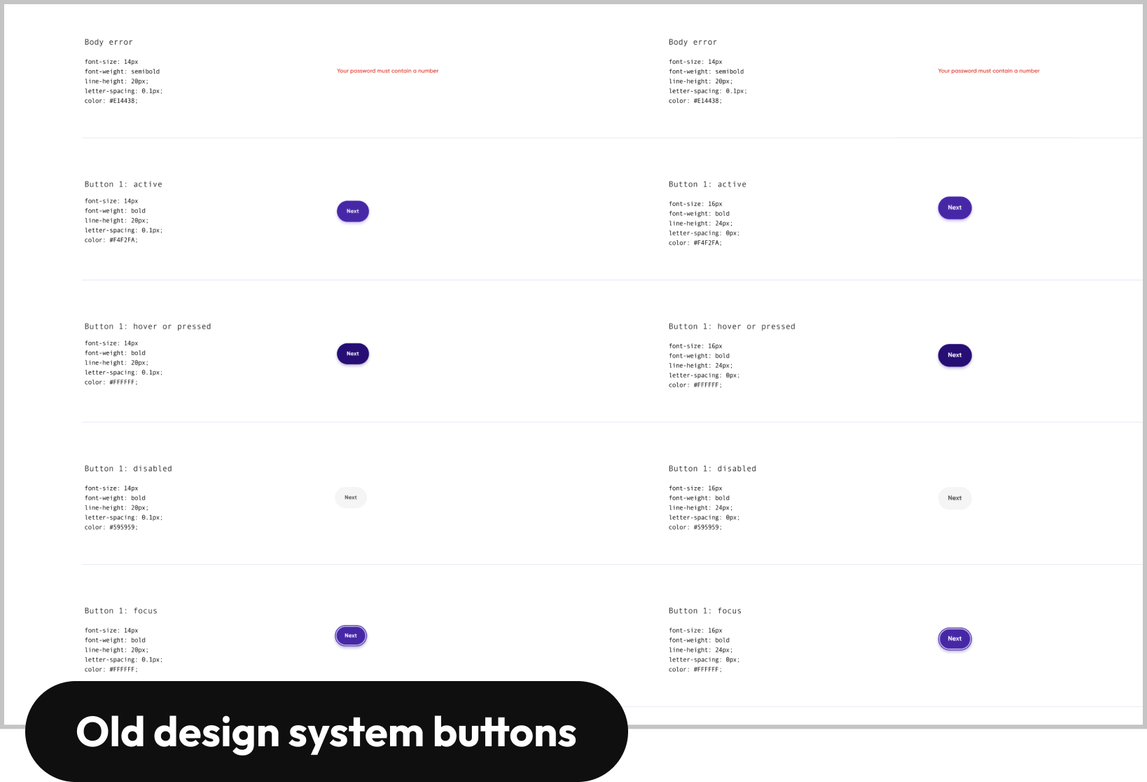
STEP 4: I built a brand new design system from the ground up and used the previous system details where possible - For example: Using the same naming conventions as the development team - As well as building any new components, creating page rules, and standards at which all future designs would need to adhere.
Results
09
Files
23
Journeys
110
Screens
419
Styles
191
Components
HIGHLIGHTS:
Easy to understand and share DS, this allows for changes within the system that will update to other projects (Atomic design).
Clear rules informing developers, product managers, and designers on how and when to use these new elements - A brand new look and feel to the site that matches the upcoming app release and all within time for the Marketing winter campaign.
A clear plan for not only how the initial rebrand will look, but also how we can further update any outstanding pages that may be missing the Loqbox rebrand- We saw no increased drop-off following the rebrand which we all saw as a great result.