
Improving Member-first sign-up

With Loqbox working to release more and more of their products in the US market, I was set the task of implementing the membership-focused sign-up journey for our US audience. “Membership-first” being a journey to get new users signed up and set up with a membership from the start. This has proven to be a successful sign-up journey within the UK but hasn’t been updated much since it’s initial release.
Due to the screens being rebuilt for the rebrand, I took this to be the perfect opportunity to conduct some user research on the journey and find out our users’ pain points then make any improvements that are needed for the US market and then bring those changes into the UK site.
The challenge
Initial experiment
For this test, I had 3 days to conduct and synthesise the results before sharing them with the CEO for a final decision. To get the best results in the allotted timeframe I decided to run unmoderated interviews with a handful of users. This way I could hand over an interactive prototype and allow our “users” to go wild and get a sense of how the product would work for them in its current state. We only had a week to run the test and synthesise the results so I decided to only have 4 users run through this test. The test was undertaken by 4 users, this was due to the results coming out as generally the same for all 4.
The audience involved were all American-based and would describe themselves as “Having some knowledge on credit but I’m no expert.” This proved to be an interesting description as 2 of our users described themselves as such but when asked questions they answered them in great detail and would normally be described as “expert” users. This was something I then used when building audiences in the future.
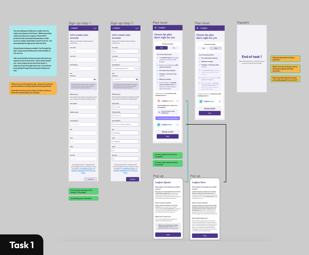

Results (Test 1)
Once we had the 4 users run through the above tests the improvements required became quite clear as all our users mentioned similar issues. After recording the notes based on the interviews I wanted to synthesise the results into clear improvements that we should make. To do this I broke them down into, positive (Green), neutral (Blue) , and negative (Red) comments relating to the relevant screens, I also included a 4th type which related to UX/UI comments that we should consider (sisplayed in Orange). This helps to visualise where our users are facing issues with our journey and highlight areas where we are effective.
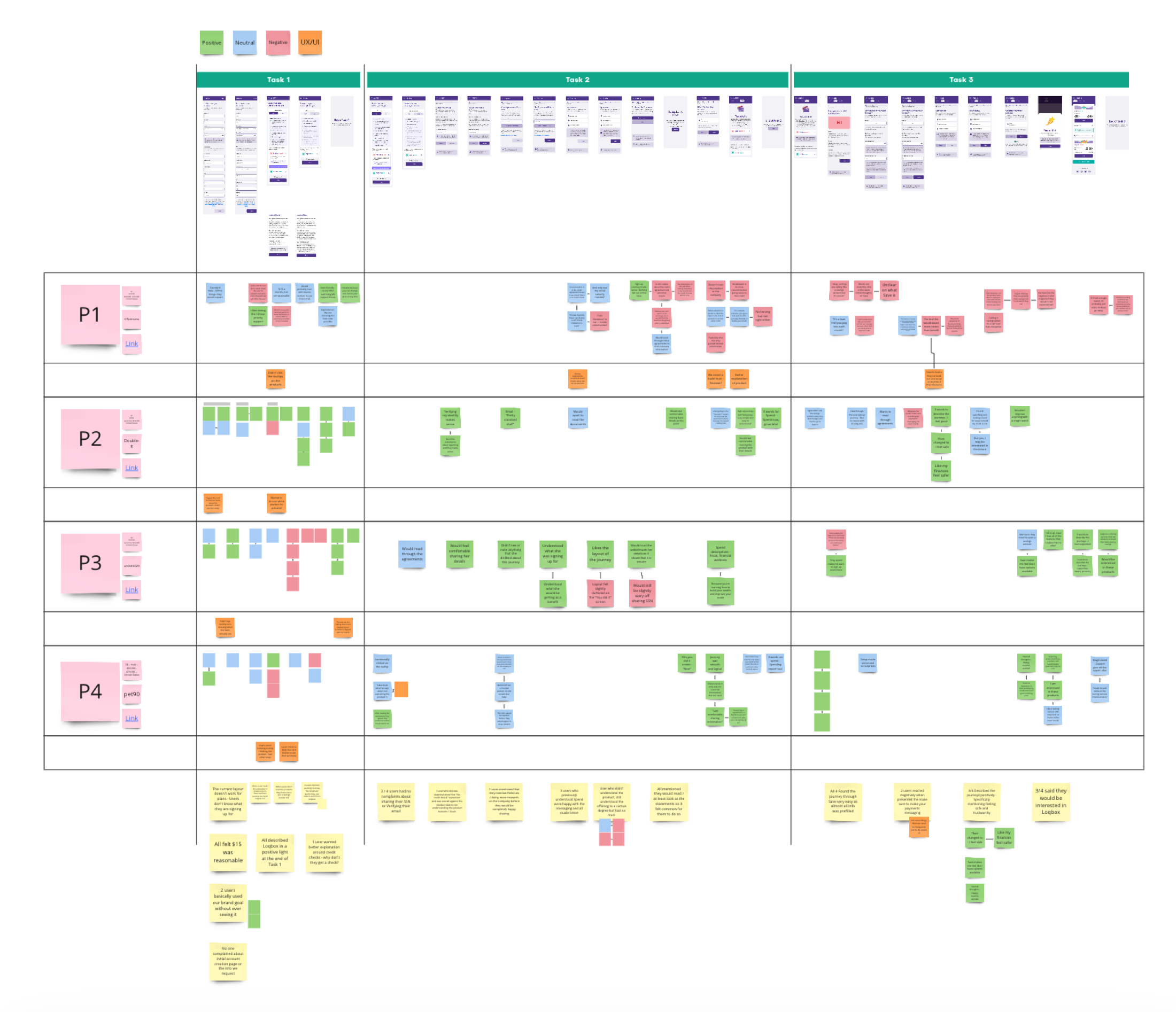
From the findings, it was shown that we were not clear on what our users were signing up for. This created a feeling of mistrust throughout the journey. Some users would spend the time to research the company further to quiet those doubts while others said the site was too far gone and they would not sign up for the product.
Off of the back of these findings, it felt that if we get the explanation right at the start of the journey our users are happy with the rest of the journey. Due to how the journey is currently set up, the plan page (where we display our product information and how much they cost the user) felt like the area to focus on when coming up with improvements before testing again.
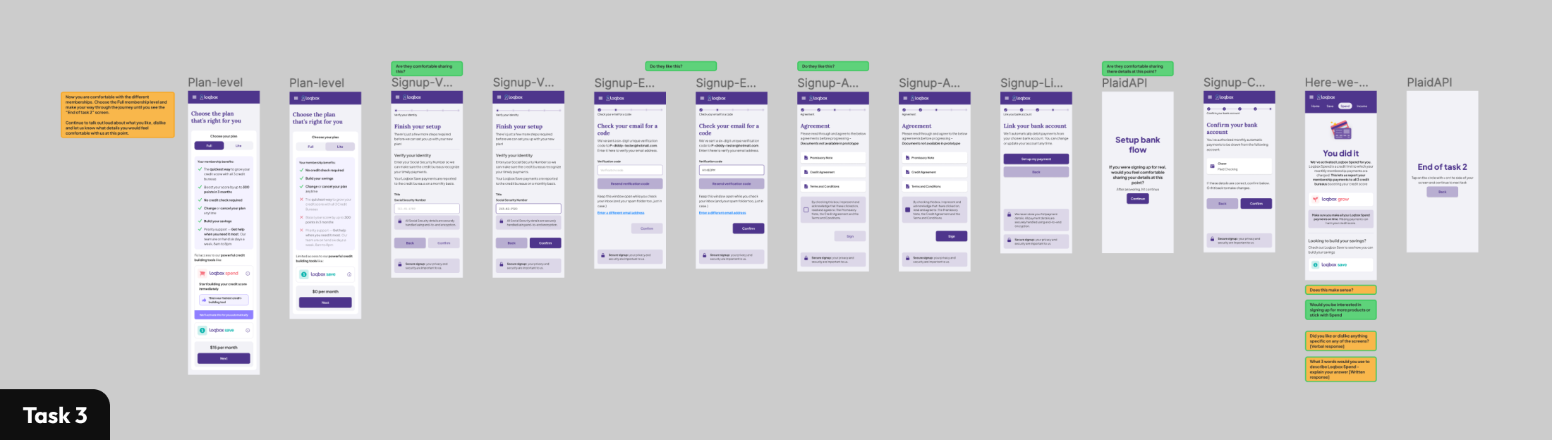
Iteration
Now that we had our initial experiment complete and had some areas to look into I began building out several solutions for us to user test with a focus on the plan page previously mentioned. The overall premise is that if we give access to further product info the users who need it will feel more confident in what they are signing up for and thus build greater trust and lead to more users signing up for our product + fewer downgrades at a later date.
This felt like a logical next step as based on the previous experiment I could confidently say that our users liked having the option to find out more information before continuing on with their journey and that the information we previously offered answered a number of questions about the products. So as a follow-up experiment, I wanted to take a closer look at how we delivered this information to our users. This way I could convince our stakeholders that this information is useful to our users and that we are also delivering it in the most effective way possible.


With this focus in mind, I was able to come up with 4 versions to test. Most of them followed the same concept:
Supply a pop-up that our users can interact with if they need more information surrounding the product.
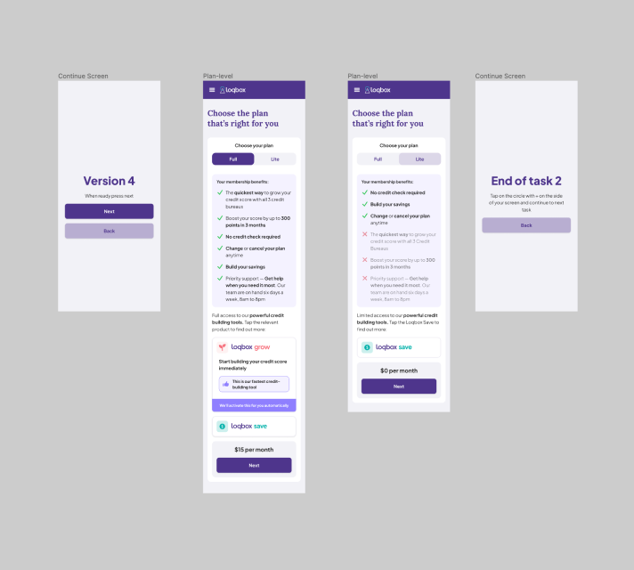
This experiment was broken down into 2 tasks. Both times the goal was to complete the sign-up journey talking through how well you understand the product and how you would feel while completing the journey. With the focus being on the delivery of the extra information, I chose to do two designs. One in which the user is presented with a clear CTA for them to use and the second option is a tooltip icon.


As a bonus of this test, I included some extra versions to test out further questions we had.
For example: Do our users prefer seeing the products first or the membership benefits first?
Results (Test 2)
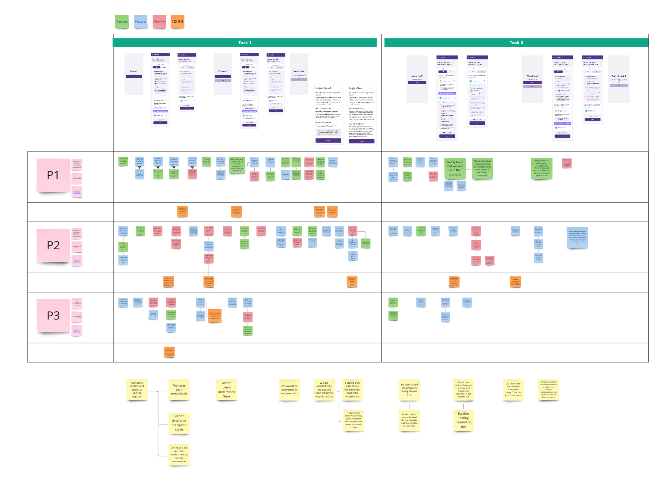
Again, because this experiment needed to be completed and results needed to be shared in such a small timeframe I could only allow 3 users through the experiment. With this being said, all 3 participants agreed that V3 was their preferred version (with the products leading the way and liked the added CTA’s stating "Tap to find out more") and I felt confident to share this information back to stakeholders.
After completion of the testing, I also included some further experiments that could be completed at a later date based on the feedback that we received from our users on the journey. These experiments included:
Further testing should be done on the benefits to find out what our users want to know most
Looking into testimonials and case studies to help build trust further with our users
Final thoughts
Overall the project was very well received and development began immediately on the project with stakeholders and leadership stating that they felt extremely confident in how the designs would be received once the feature was released in the US. In the end, leadership liked the results so much that they requested designs for the UK site and the team worked these changes into the backlog ready for testing on the live site at a later date.
I personally feel that the experiments I put together were well throughout and gave confirmation to a lot of the assumptions that the team had been making. They also offered good insight into how potential users view the product and flagged up some potential red flags that we could hope to address in the future.